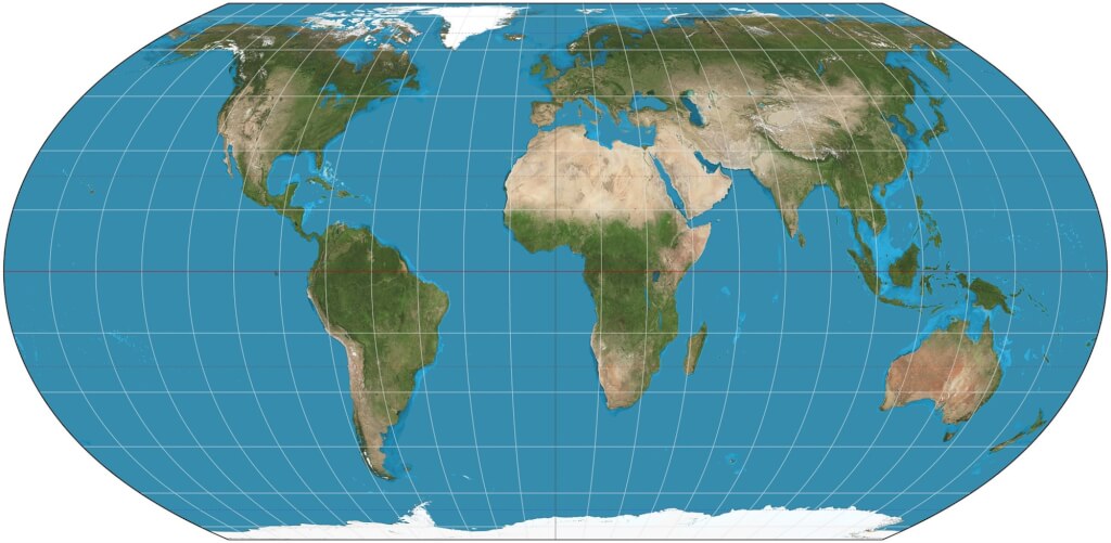
In early September, the UN General Assembly passed a resolution—proposed by Togo with the backing of other African nations—encouraging the use of map projections that more accurately represent the surface area of continents, such as the “Equal Earth” projection.
The commonly used Mercator projection dates back to the 16th century and was designed for navigation; however, it presents a highly distorted view of the world. It exaggerates regions near the poles, making Africa appear roughly the same size as Greenland, whereas in reality, Africa is fourteen times larger.
Advocates hope that by correcting these distortions, they can alter public misconceptions about Africa and prevent the continent from being symbolically marginalized in the collective imagination and global consciousness.
Following the UN vote, the French Ministry of Foreign Affairs announced it would abandon the Mercator projection in favor of the “Eckert IV” projection, which offers a more realistic representation.
While the Eckert IV projection depicts equatorial regions with greater accuracy regarding scale, it conversely makes Europe, China, the United States, and Russia appear smaller.
French Foreign Minister Jean-Noël Barrot remarked at the time: “Changing a map certainly cannot change the world, but correcting a distorted representation of the world is an act that affirms the truth.”
Some activists view this shift as a move toward cognitive justice.
Fara Ndiaye, Deputy Executive Director of the advocacy group “Speak Up Africa”—which helped launch the “Corriger la carte” (Correct the Map) campaign in 2024—stated in an interview with Le Monde this past April: “Maps are not neutral… they are powerful symbols that shape our worldview. When Africa is consistently depicted as smaller than it actually is, the implicit message conveyed is that it is a peripheral region.”
The political nature of maps extends beyond the discrepancies in area caused by projections; it also encompasses the delineation of borders and the naming of territories. For instance, Trump frequently uses maps to convey his views—such as unilaterally renaming the Gulf of Mexico and Lake Ontario as the “Gulf of America” and “Lake America,” or hinting at renaming the Strait of Hormuz the “Trump Strait.”
Earlier this month, Trump posted a map on social media that depicted the United States, Canada, Mexico, Greenland, Iceland, Cuba, Jamaica, other Caribbean islands, and parts of Central America all colored in the style of the U.S. flag.
The French overseas collectivity of Saint-Pierre and Miquelon, located in the North Atlantic, also appeared to be included within the U.S. flag’s design. French President Emmanuel Macron made a special visit to the islands on the 19th of this month to reaffirm their status as French territory.
Additionally, Le Monde reported that Russian President Vladimir Putin has declared 2027 the “Year of Geography” and plans to release new maps. These could incorporate annexed Ukrainian territories or reflect Russia’s ambitions in the Arctic. Against a backdrop of resurging imperialist ambitions, some nations are using maps as political tools to assert ownership—or desired ownership—of specific territories.
From the debates over perception sparked by the Mercator projection to the way some countries use maps to alter place names or delineate spheres of influence, it is evident that maps are never merely neutral geographical tools; they shape how people view the world and reflect a nation’s own perspective.